
Sunday, 1 April 2012
Proof of Permission
I contacted the artist that wrote 'Getting Rid of Me' and here is proof of the permission he granted us to use his music.

Friday, 30 March 2012


Wednesday, 28 March 2012
Digipak

For the background image, across three sections of the inside, we took a photo of an iconic location from our music video. This is a particularly memorable setting as this is where the couple cross paths realistically and technically. Stretching it across a number of sections instead of on one sections symbolises that the couple had been on a long journey. The river is slightly off centre as if to suggest the imbalance in their relationship. The natural setting presents a peaceful atmosphere of calm and serenity, which provides a suitable basis in the lead up to the climax.
We included an image of the artist so that the audience are aware who he actually is. The male in the video just represents the actual artist as the character is specifically suited to the actor. This image shows the artist in an almost industrial deserted location to make the image blend in with the other images. It also prevents it from being the most dominant photo as it is not the main focal point.
The simplistic monochrome colour scheme suits the colours in the front CD image. The bold white on black font provides important information without taking attention away from the photos.
The text is formatted to mimic the text on the front cover. The name of the artist is in a simpler form to not draw audience focus away from the images however it is positioned in the same format, to the right, to mimic the artists signature imagery.
The front cover of the digipak was also used as the advert for this CD. This was to build identification and audience recognition. An exact replica was used to ensure the audience establish the artists products.
The continuity carried throughout the video and ancillary tasks mimics those we looked at of artists in the same genre. The bold use of images to attract the audience and set the mood and atmosphere was also achieved by other artists such as Benjamin Francis Leftwich.
Sunday, 11 March 2012
Rough Cut Audience Feedback
After screening our video to the rest of the class we decided to make a few changes to the music video due to our own preferences and advice of our audience.
Following suggestions we decided not to include the shot of the falling glass. This is because some people did not completely grasp the concept. The representation of the argument through symbolism was not fully understood. This was also apparent for the shot of the clock rewinding in the eye. We thought it would be effective as it was a completely original idea, however it was argued that it was not completely relevant to our narrative and disrupted the continuity due to it being abstract.
Following our own judgements we noticed that we needed to adjust some colour settings as they weren't the same throughout the video. We added in a couple of fades to suggest that it was a different day to show our video was showing a progression as if it was real life. We also decided that we needed to lighten the greyscale shots so they blended better with the colour ones whilst still showing that it was a separate sequence from the rest. It helped to show the divide to allow for personalisation with the character and capture raw emotion.
Thursday, 8 March 2012
Edited Advert

We modified our advert to replica real media products. To do this we added a small piece of text at the bottom to give additional purchase information for the audience.
Monday, 5 March 2012
Advert Analysis

This artist represents the same genre as the artist featured on our video. The acoustic style is echoed in this tour advertisement.
The colour background imitates one of an old document. The edges appear to be eroded away at the corners and compliment the eroded text. The artists name is faded and fits in with the stylistic features of this advert.
The dates are printed in the same colour as the artist name but without the fading, they are bold in capitals to make it easily read.
The image featured on this poster is the front cover of the album he is on tour to promote. All of the artwork and colour schemes fit with the acoustic genre. Everything is soft with a sombre tone much like his vocals.
The numbers are included so to encourage people to purchase tickets due to ease of accessibility. The artists website is also included on the advertisement so that people can seek additional information.
The Artist

This is the artists album cover and as you can see the positioning, font and style all mimic the one we created in our advertisement. Although this has an image of the artist and our advertisement doesn't, as it is a single from this album most fans wouldn't need to see an image of the artist as they would already recognise the name.
Our Advert for Twelve Story Fall- Getting Rid Of Me

We ensured to select the same font and structure fort he artist name as the album this single was taken from. This provides continuity for the fans as they will recognise the artist name. We decided to use a different colour scheme than the one used on the album as the colour red wouldn't have complimented this image.
We decided to take a photo of a sunset and use it as it reflects the sombre, calm tone of the track. The orange glow is eye-catching and warm which makes the advert appear inviting. This photo doesn't directly correlate with the setting used in our music video. This is because all of the outside shots in our video are during daytime. As by the end of the video, peace has been restored and the couple are happy again, this photo reflects that with calm water and the connotation of a swan which only has one partner that they are with for life. This photo demonstrates that there is 'no getting rid' of him and proves that they are happier together. This is why we chose a sunset as it shows everything is settled and projects that warm 'fuzzy' feeling when two people are happy and in love.
White serif font was used to stand out on the dark background and this particular font was used in other artists adverts that we had looked at. The additional text present, besides the artists name, reads the track title. This is written in bold italic as the italic creates a flow much like the song. The added quote acts as persuasion as a guarantee that someone else likes it, it gives you a feel for the song so you can judge whether it is something you would like. Its also makes a reference to the album to indicate that you should purchase that too. Lastly 'Single available now!' was added to provide information that was needed. the use of '!" gives it a sense of urgency, suggesting that you should go and buy it.
Change of Decision
After looking back at our font choices and options we researched more into the artist profile. By doing this, we discovered that although all of the social networking sites write the artists name as '12 story fall', on his latest album that this single comes from, it is written as 'twelve STORY FALL'.
We will ensure that it is written in the same format as the artists recent work so that our video and promotions correspond. Therefore our finalised font choice will no longer be the chosen font.
We will ensure that it is written in the same format as the artists recent work so that our video and promotions correspond. Therefore our finalised font choice will no longer be the chosen font.
Advert Analysis

The main focus of this advertisement is the artist image. This is particularly dominant spread across the right hand side of the page. His clothing is casual and his focus directed elsewhere as if to suggest he is deep in thought. This supports the soft, soothing acoustic genre of the album. His stance is although he is reflecting on life with the background primarily white and blurred at the bottom. Although his arms are crossed his expression is somewhat peaceful which mimics the atmosphere of the album. Accompanying this image is a photo of the album cover. It is a simple design of textured stipes of colour varying in size. This symbolises the artists name 'City and Colour' as the stripes suggest the layers of the cites structure.
The text included on this advertisement about the album itself provides all the relevant information, plus some persuasive techniques. The main heading on the top left hand side of the page simply says 'he's on fire' with no use of capital letters, this mimics the soft sound of the tracks as there is nothing harsh or rigid about the letters much like the sound. This simple yet effective claim is intriguing to readers as its metaphorically complimenting.
Below the album image the price is the next biggest writing as if to suggest it is good value for money and does not cost a lot. This is because if it was to be considered expensive, it wouldn't be included on the page or would be written in small print.
Strictly below the price the text states 'CD out now' in a simplistic black, bold font. This is important information to include on an advertisement as people will want to know when it is available. Below this is the artist name and then below the name of the album. The fact that it is in the same print as the other text suggests that the name isn't important because the album is so good and the album cover is individualistic so easily recognisable.
The additional text states what other forms are available 'deluxe CD/DVD version available' and also includes a quote with a rating from popular music magazine 'Rock Sound'. This shows his star quality and recognition from such a well known persuasive magazine. There is also a short paragraph stating his 'Sold out show' and the 'long awaited follow up' with mentions of his back catalogue and singles. This additional information provides a nice background to the artist profile, proving how successful he has already become and how much he has achieved.
Kristie Henry
Friday, 20 January 2012
Finalised Font Choice


Title Options For Digipak
We looked at a number of fonts that we thought suited our genre of video and decided on an eroded font. This is following research into other artists product and advertisements of the same genre.

We liked this style font but thought that it looked slightly gothic and so therefore would not be suitable for the opening titles and font for the digipak of our products.

The eroded effect works well with this font however we thought that the lettering was slightly too thick. That made it just seem unsuitable for our video as the song is soft and acoustic, not powerful and bold.

We were thinking of using a white font but this was the only one that was available so we are going to experiment with colour inversion as we do not like the style of this font.
Digipak Rough Plan

Friday, 13 January 2012
Star Image
Plan B
 Plan B, real name Benjamin Paul Ballance-Drew, started out as an underground grime artist, well known for his explicit, hard-hitting lyrics with disturbing and emotional concepts. “Who Needs Actions When You Got Words”, released in 2006, charted at number 30 and gained five star reviews despite his controversial lyrics. The album gained Plan B a ‘hard man’ status due to the anger expressed in his music concerning personal experiences expressing his troubled life as a child. He witnessed many criminal activities growing up in East London and this was reflected in his music. It acted as escapism to steer him clear of the trouble he could easily be caught up in.
 His recent concept album “The Defamation Of Strickland Banks” has seen him mature, and experiment with acoustic and soul genres. This narrative album stormed into the charts straight at the number 1 spot. Along with the change in genre, he also changed his image. Plan B became a well-groomed male, well known for wearing a grey suit and black shirt. His smoother image saw a drastic change from the scruffy tracksuit-wearing boy he had once been.
Well rounded and exceptionally talented, Plan B is a rapper, singer, songwriter, actor and film director. His recent image transformation made him a prominent force in the industry and ensured he was taken seriously. This saw him land roles in popular films such as ‘Adulthood’ ‘Harry Brown’ and “4.3.2.1”. He was heavily involved and took an interest in the directing role, which helped him to feature some of his music on the official soundtrack such as ‘End in the Streets’, ‘On It 08’ and ‘I Need Love’.
 Ben Drew has recently expanded on his first full length film 'Ill Manors'. The narrative is narrated by the soundtrack; 'The Defamation Of Strickland Banks'. The film explores six short stories that are all interconnected. Its a hip-hop music based feature film that further confirms Plan B's talent and star quality.
http://www.youtube.com/watch?v=ZTHv4F0XcuA&feature=related. In 2011 he won Best British Male at the Brit Awards, further confirmation of his talent.
Plan B's success has been aided by his music and appearances in advertising. He has featured as part of Packards laptop campaign which featured a UK cinema shown film of him recording his album.
 Ben Drew also appeared in Bulmers cider advertisement that featured a live performance by Plan B.
Jordan Griffin
Wednesday, 11 January 2012
Advert Analysis

You Me At Six’s advertisements and posters also echo their newly found mature approach to their music. All of which co exsist with the monochrome colour scheme used with the album. The bold white writing on contrasting black is a signature look for You Me At Six’s new era. Their advertisements make a statement. They suggest that the band are serious about their music and will put in their all to provide for their fans.
The inclusion of an image of the band in this poster is likely to see more females persuaded to purchase tickets due to their rock band image. However the colour scheme and simplistic yet effective fonts also generates interest from males as they may idolise the band or percieve them as role models. The expressions on the faces of the band show their commitment to their fans and to their music. The bands clothing is very casual but very stylish. This makes them appealing to both genders.
The banner of text is slightly slanted which is eye catching as it is out of the ordinary. Anything that is off centre is likely to catch your attention as it is not the symmetrical norm. The rough edges around the image also mimic the bands new image. It also suggests that the band bring something new to the table, that they are going to dominate the music scene. This is enchoed in their stance. Everything about this advertisement is a clear statement, the band are here and they are going to take over, it reflects their determination and commitment to eachother, the music and their fans.
Kristie Henry
Digipak Research
DigiPak are a form of packaging for a CD that is only usually used for special editions due to its lack of resistance to abrasion. The packaging is made up of six panels of gatefold paperboard outer binding with either plastic trays or sleeves to hold the CD.
 Rock band You Me At Six’s most recent album ‘Sinners Never Sleep’ was released as a DigiPak. The whole album theme is reflected and enhanced in their first music video ‘Loverboy’. The album focuses on the band being ‘Sinners’ and indicates the bands carefree fun image has now disappeared. This album shows them in a more serious light.
 The album shows the band as prisoners and the inside of the digi pak is decorated with their fingerprints. There are also inserts that are photos of each band member taken as a mugshot and on the reverse a drawing of what would be done when in court.
The booklet included with the album is very simplistic with the lyrics being written in a type writer font with thank you’s and an image of the band on the front. The two images of the band are shot in a very dimly lit location and use the black and white effect just as the rest of the album artwork. One image is extremely dark with very little light on the band in a deserted location which looks like a cell. All of the band wear a dismal look as if they are in deep thought. The other image is shot from a low angle to show the band as dominant and powerful. There is bright lighting to highlight each of their faces with a triamphunt expression. Their clothing is very simple, just casual dress in dull colours to compliment the rest of the artwork.
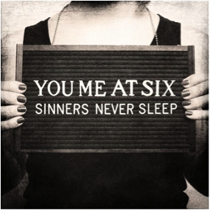
The front cover of the album is a close up of a females chest and hands holding a board with ‘YOU ME AT SIX SINNERS NEVER SLEEP’ on it in a bold white simplistic font. The contrast of white on the black board is very effective and connects with the rest of the monochrome colour scheme.
The two discs included are also in black and white with contrasting text.
The booklet included with the album is very simplistic with the lyrics being written in a type writer font with thank you’s and an image of the band on the front. The two images of the band are shot in a very dimly lit location and use the black and white effect just as the rest of the album artwork. One image is extremely dark with very little light on the band in a deserted location which looks like a cell. All of the band wear a dismal look as if they are in deep thought. The other image is shot from a low angle to show the band as dominant and powerful. There is bright lighting to highlight each of their faces with a triamphunt expression. Their clothing is very simple, just casual dress in dull colours to compliment the rest of the artwork.
The front cover of the album is a close up of a females chest and hands holding a board with ‘YOU ME AT SIX SINNERS NEVER SLEEP’ on it in a bold white simplistic font. The contrast of white on the black board is very effective and connects with the rest of the monochrome colour scheme.
The two discs included are also in black and white with contrasting text.

This album concept appeals to many rock fans. You Me At Six were well known to be young pop punk stars with a teenage audience but the new mature style and heavier music has encouraged a much wider audience. Without having the band on the front cover and only limited pictures of the band, it is less likely to sell primarily based on image. The monochrome colour scheme looks very mature and the theme compliments this. Now they have undertaken a much more serious manner, they appeal to a more diverse audience. The consistency of the theme, colour scheme and font makes this album appear very professional which will help to attract new fans as the band are clearly well established.
Kristie Henry
Star Image
YOU ME AT SIX
You Me At Six are a five piece rock band from Surrey. They have released three albums since forming as the line up that they are now, in 2007 at the tender ages of 17/18.

Each album has a distinctive sound that expresses both the musical and emotional maturity they have experienced.
“Take Off Your Colours” released in 2007 and then re-released in 2008 is a generic pop-punk album. The album art work is very simplistic yet artistic and relevant to the album.
The songs have the typical boy/girl relationship storyline, which is echoed in their music videos.
Their first independent video “Gossip” was shot on a handheld camera at a house party they hosted. It uses very simplistic techniques and primarily demonstrates the fun lifestyle they lead as teens with short performance clips. The main identification is with the lead singer Josh Franceschi who is mobbed by girls as he walks through the party.
 “Save it For The Bedroom” sees the band experiment with intertextual references such as the video concept of a chat show and voyeuristic techniques. At the time director Shane Davey would have used these techniques to help establish the band as professional yet still carefree and therefore a typical pop-punk band. This is highlighted when band member Max Helyer runs on stage naked, covering himself with a pineapple before using it to help destroy the stage.
  Later music videos from them such as “Jealous Minds Think Alike” see the band experiment with a performance based video with close identification with each band member rather than just the lead singer. This establishes the band as a whole and focuses on their desire to play music. The whole video has a slightly darker atmosphere, aided by the fact it is shot at night, which makes the video appear more mature.
 Their second album ‘Hold Me Down’ demonstrates them experimenting with a slightly heavier sound. This is mimicked through the album artwork. The cover vaguely shows a boy walking through an explosion of colour, this represents the burst of emotion lead singer Josh Franceschi was experiencing whilst writing this album. He was going through a break up with his long term girlfriend and the songs reflect those difficult times. Each single that was released acted as a chapter in his story which was shown through the signature consistent artwork. His lyrics can relate to many teens and so they form the basis of the target audience.
 ‘The Consequence’ was the first track released from this album and featured vocals from Sean Smith from ‘The Blackout’. This was a much heavier song due to the ‘screamo’ vocals. The video is black and white and is a performance based video. It features shots from their headline tours and backstage antics. This felt like a more mature approach from the band.
 The next video released is one of their biggest hits to date. ‘Underdog’ soared its way into the UK charts and is regularly featured on reality TV shows and as diegetic background music in soaps. The video is primarily performance based but has the side storyline of a relationship that falls apart due to cheating. It features characters of the late teen age so once again is relatable to the audience. It uses low key lighting to once again indicate the bands darker side.
 Another video released from ‘Hold Me Down’ was ‘Liquid Confidence’. This was also a performance based and narrative video featuring the band. This video shows the lead singer heartbreak as he tries to put on brave face for filming the music video. Included are shots of the band feeling frustrated and resulting in them giving up trying and dealing with all their hard feelings. This allows the audience to identify with the band as everyone experiences rough times and it shows that they are human.
 Their last video released on this album was ‘Stay With Me’. This is also one of their biggest hits, with its anthemic chorus it really connects with the audience. It is also a performance based and narrative video showing the concept of growing and nurturing a relationship to make it work. This shows the band in a softer light but still with the slightly somber tone in the verses. The location uses very high key natural lighting as it is in a field in California. This gives the impression of it being a big song due to the amount of space that is being used to convey the meaning to the audience. It feels as though the band have been stripped down to show off their talent with the narrative being there to support and give meaning to the emotion sung in the lyrics.
 Before the release of their third album, You Me At Six released a single with rap artist Chiddy. The track was titled ‘Rescue Me’ and caused a lot of controversy. Many fans felt as though the band were loosing their identity and turning mainstream due to its air play on well known radio stations and the different sound they had experimented with. The video is a narrative video that shows a boxers struggle with life, with the boxing symbolizing this. The artwork for this single was a red cross on a white background, building references with a casualty/hospital. After the release of this single, there was a lot of uncertainty concerning the route the band were taking for their next album.
 You Me At Six’s highly anticipated third album ‘Sinners Never Sleep’ was finally released only recently. This album has seen the band dub their carefree pop punk attitude and condone a more mature and serious rock approach to music. This is echoed in their album artwork, with the use of a monochrome colour scheme and the theme of prison. The music has adopted a heavier tone and their image has certainly adapted to match this. The once clean cut fresh looking boys now look like the mature rock stars they sound like.
Their first single ‘Loverboy’ is much like the anthemic sound we’re used to from them. However it is slightly heavier than the pop punk sound that’s so familiar. The music video definitely aids in adopting the darker mood. It shows them undergoing police interviews and lashing out in anger in most cases. There are also some performance based shots incorporated into the video whilst in the interview room. This however sees the introduction of a group of people crammed into the room whilst each individual band member plays their part. The low key lighting, red tint and raw emotion portrayed into this video show You Me At Six as a real rock band. It puts a whole new outlook on their music for all its audience.
You Me At Six burst onto the music scene in 2007 as fresh faced, fun loving boys who just wanted to make music, now they are selling out arena tours and taking the rock scene by storm. The media have been there through every step of their journey of growing up and establishing themselves as a band.
 In early interviews they were dubbed as hot shots in skinny jeans and vans but a recent interview in Kerrang! was titled ‘death to pop-punk come over to the dark side’. To suit this new image they were creating, they have adopted a rougher look. The once clean cut boys are now experimenting with tattoos and facial hair, making them more so appealing than they ever were. Their new found sound has come after a long emotional journey with more ups and downs than you could ever believe. Some heartbreaking events have happened which have not only matured the band but brought them closer than ever. This strong bond they now have is easily read and digested by their fans, helping with the success of their music.
 In video interviews it is still clear to see the band like to have fun. Although they have grown up a considerable amount, they are still young and fun. With the videos it is clear for the audience to see who they really are and learn to like them as people not just musicians. Their tour diaries are examples of this. You get a clear insight into the touring lifestyle and how they cope living with each other and away from home. You can’t lie to the camera so whatever they are feeling, you feel it too.
 As well as having their own YouTube channel, the band are on all other social networking sights; Facebook, Twitter, Flickr and MySpace to name a few. Twitter allows their audience to hear from the individual members of the band and not the just the band as a whole. This helps to build identification and a connection between artist and fans.
The bands official website also supports all of their social networking sites with a wall for posting comments and the ability to read news, bio and view a gallery of the band along with links to tour dates and merchandise.
All of the above internet sites aid in the promotion of the band however due to their recent success, they have frequently appeared on radio stations such as Radio1 to plug their new album. There have also been advertisements in music magazines and on music channels such as Scuzz, NME and Kerrang! to advertise their tour. This cross media production is essential for the bands success.
 Three members of the band have their own clothing ranges that they often model which acts as promotions for their products to their fans. Matt Barnes owns clothing company ‘Cheer Up Clothing’ Josh Franceschi heads ‘Down But Not Out’ and guitarist Max Helyer runs recently established ‘Become Antique’. These clothing ranges are worn by all of the band and often other bands of their genre. This generates a style that appeals to their audience.
You Me At Six are renowned for their sell out tours and atmospheric vibes. Their crowds absorb the emotion and are more than happy to sing back the lyrics creating an indescribable overwhelming feeling. The bands energy is echoed throughout the crowd with them complying with anything lead singer Josh asks of them. Their talent and skill is unquestionable and has seen them secure sets year after year at well known festivals such as T in The Park, V Festival and Reading and Leeds just to name a few in the UK. However their success is worldwide! They have also played the Warped Tour in America and Soundwave in Australia along with many others.
 The band are quite open during interviews with sharing information so any gossip surrounding them is soon cleared up. Most of the talk surrounded Josh Franceschi and his break up with long term girlfriend which triggered album number two ‘Hold Me Down’. Their recent album came in a deluxe edition which included their documentary ‘Bite My Tongue’. This told the story of the band from day one, through the ups and the downs, the bad times and the good, all is exposed. Rumors of their break up are cleared up and personal life crisis and heartbreak are also dealt with. This documentary is truly moving and builds a strong connection between the audience and band. You experience and understand their journey as a band and their process of growing up.
Kristie Henry
Music Video Analysis

Underworld-
Born Slippy
 This is a very surreal abstract video that compliments the diverse beats and trance rhythm. It is also the official soundtrack to the film ‘Trainspotting’ which helps the audience to understand the video concept and representation. The video shows a man’s drug addiction driving him to insanity. It shows him rocking, clutching his head in his hands; expressing his frustration. This is combined with the bright lights and dance culture of the 1990s.
The video doesn’t include any performances from the artist, which is quite typical for this genre. The main theme is the 90’s lifestyle and the addictive culture.
 The mise en scene is very basic which concentrates and enhances the video concept. There aren’t many props used, most of them being cellophane sheets to add to the effects in the postproduction. There is however minimal props used in the shots of the character; he is holding what appears to be a remote whilst listening to an iPod through earphones. There are also props in the background of the quick location shots such as a fire extinguisher. The characters costume is very representative of this decade. They are abstract to suit the nature of this video.
Disorientating lighting and camera work is used to compliment the trippy dance music as fast flashes of colour and quick abstract movements are used. No other sound except for the music is heard but unconventional editing techniques are seen. Fast edits between shots and sequences played backwards and in slow motion are all used to again show the effect of drugs and music on the character.

The Character doesn’t lip sync the repetitive lyrics but portrays them with his body movement and facial expressions. The frustration and aggression he shows compliments the repetitive lyrics and trance music.
This video is effective in its interpretation of the 90’s drug and dance music culture. The character looks uncomfortable and expresses this by rocking and pulling eccentric facial expressions. The editing works well with this as it is fast at some points and slow at others. This, along with the slow motion and shots shown in reverse, portray the ups and downs of the drug addict life. Most edits are in time with the music but some seem to be purposely too fast or too slow in order to show the change in the characters feelings.
Jordan Griffin
Jordan Griffin
Friday, 6 January 2012
Music Video Analysis
 Blink 182-
The Rock Show
 This music video opens with an explanation of what is going to happen in the video. Its an experimental video that sees the band being given $500,000 from their production company to make the video themselves. It sees them driving around Los Angeles getting up to all sorts of antics such as distributing money to people around the town, giving a homeless man a hair cut and a suit and taking him to a strip club, paying people to shave their hair, buying and releasing doves, paying strippers to clean a mans car, buying cars and a tv to destroy them, paying for a banner on a plane to advertise their album name and giving skateboarding gear to young skateboarders with a guest appearance from Jeremy Klein.
  There are also performances from the band in various locations including a small studio, and a shopping centre.
The lighting is natural light which is aided during the shots of the band performing and any shots indoors by strobe lighting.
 There are various locations used in this video such as a small studio, a shopping centre, a barbers shop and a strip club. None of these locations were enhanced or modified in any way so all of the props that were used throughout the filming were there previously.
 The camera work is also very basic to focus on the concept of the video. A fish eye lens is used whilst the band are performing in the small studio to make the shot more interesting and focus on the band not the space. There are also lots of shots of the band followed by medium and long shots of the activity and the people involved. This helps you to identify and remind you the video is all the bands ideas. The majority of the shots are either eye level or low angle due to the lack of plans for the video however there are a few high angle shots when the band are performing in the shopping centre as they were capable of filming from the next level. Long shots are used when the band and the public are skateboarding and performing in order for the audience to understand the scale of what they are doing and the amount of people involved. Quick pans were also used to show the whole situation. The cameras proxemics were not crucial to this video which is obvious from the camera quality and this draws the audiences attention to the ideas and things activities taking place in the video.
 Along with the non diegetic song there are diegetic sounds in the beginning of the video as the band are explaining what is about to happen, there is also the sound of the car driving off before the music begins. This informs the audience so that they understand that the video is just about having fun.
 The editing is very simplistic to match the rest of the video and keep things coherent. Quick cuts are used to keep the pace and hide any camera jolts, making the video appear to be filmed a lot smoother.
The relationship between sound and image doesn’t appear to match considering the lyrics are telling us about ‘the girl at the rock show’ however the video does include ‘rock shows’ and there is the large majority of females involved in the filming so although they done appear to be directly correlated, they do compliment each other nicely. The majority of the filming doesn’t see lip syncing whilst the band is out spending their money. However the shots of the band performing show that even though most of the budget was blown on the band having fun, they do still match and aren’t out of time.
 There is a reference to the Foo Fighters who are another rock band when the lead singer spits into the camera whilst performing in the studio much like Dave Grohl in the ‘Monkey Wrench’ video.
I think the whole concept of this video is what makes it effective. Its entirely experimental and makes us as audience members feel like we are in the bands heads as we are witnessing what they would do with the money for a video and it turned out to be really successful. It’s just a fun, carefree video with a different spin on the norm.
Kristie Henry
Subscribe to:
Posts (Atom)